
Haircare / Visual identity
Find your everyday rhythm.
A bold, flowing identity that makes a three-step haircare routine easy to recognize and navigate.
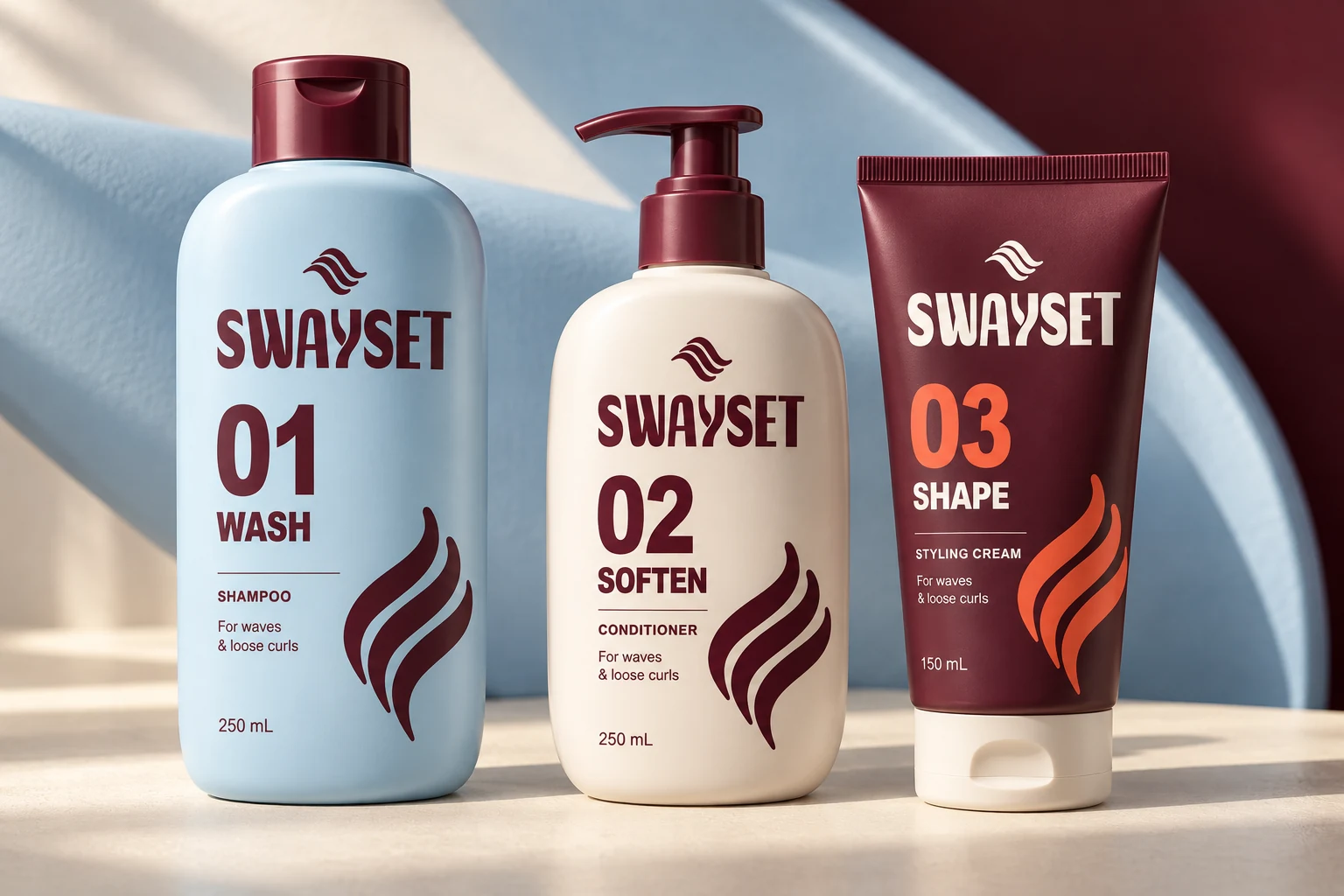
Visual identity / Lettering / Graphic system / Application design
A specific starting point.
Give a small haircare range a distinctive shelf presence while keeping each product’s purpose, sequence and size easy to identify.
A reason for the form.
A curved interruption in the lettering introduces movement. Three related strands carry that rhythm into a mark and a flexible graphic system.
A system with a purpose.
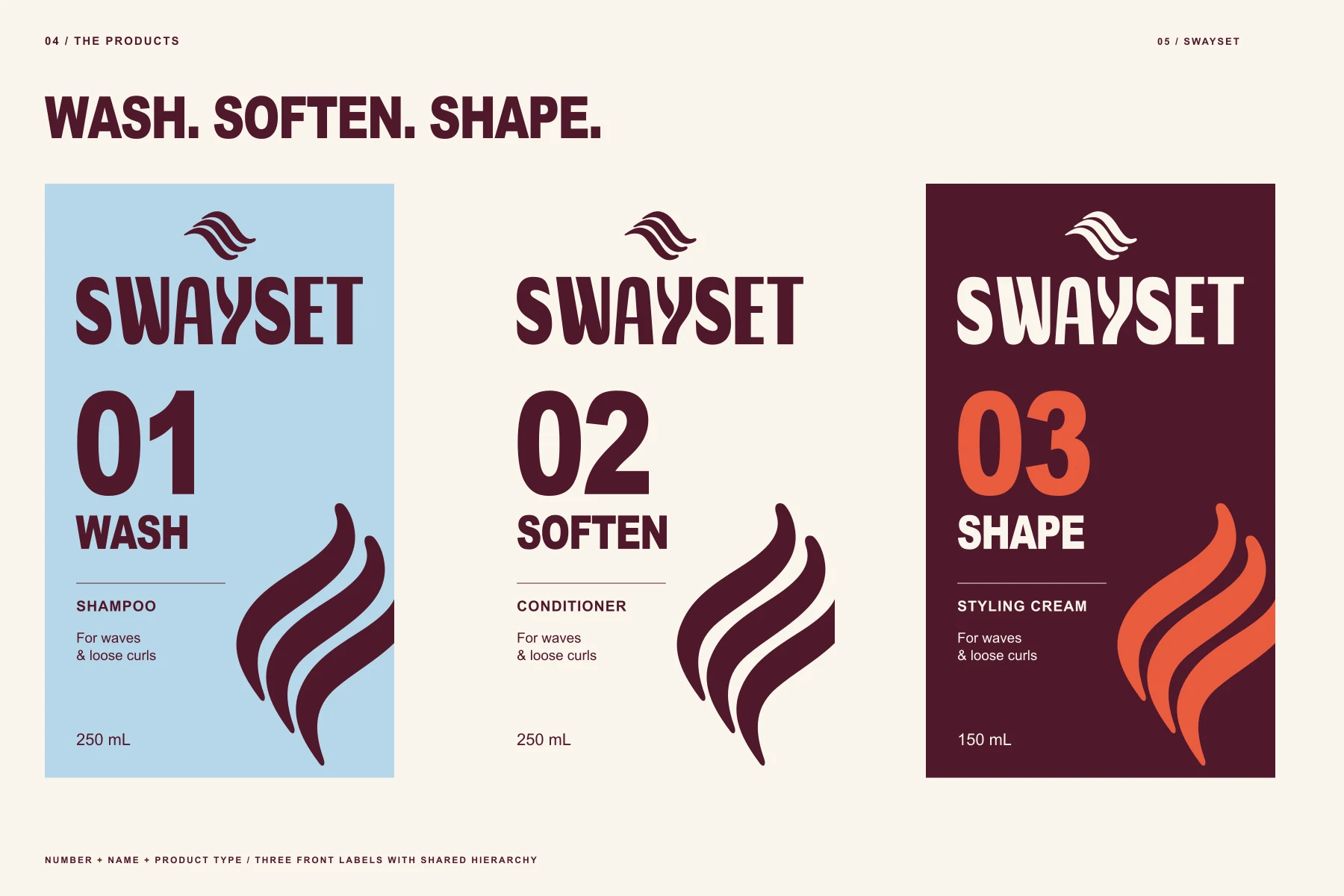
Condensed lettering gives the name weight. Oxblood, powder blue and warm paper separate the range; large numbers and direct product names make the order clear.

Wash. Soften. Shape.
The same information order repeats across each label: brand, step, product purpose and supporting detail. Variation belongs to the product, not to the underlying logic.
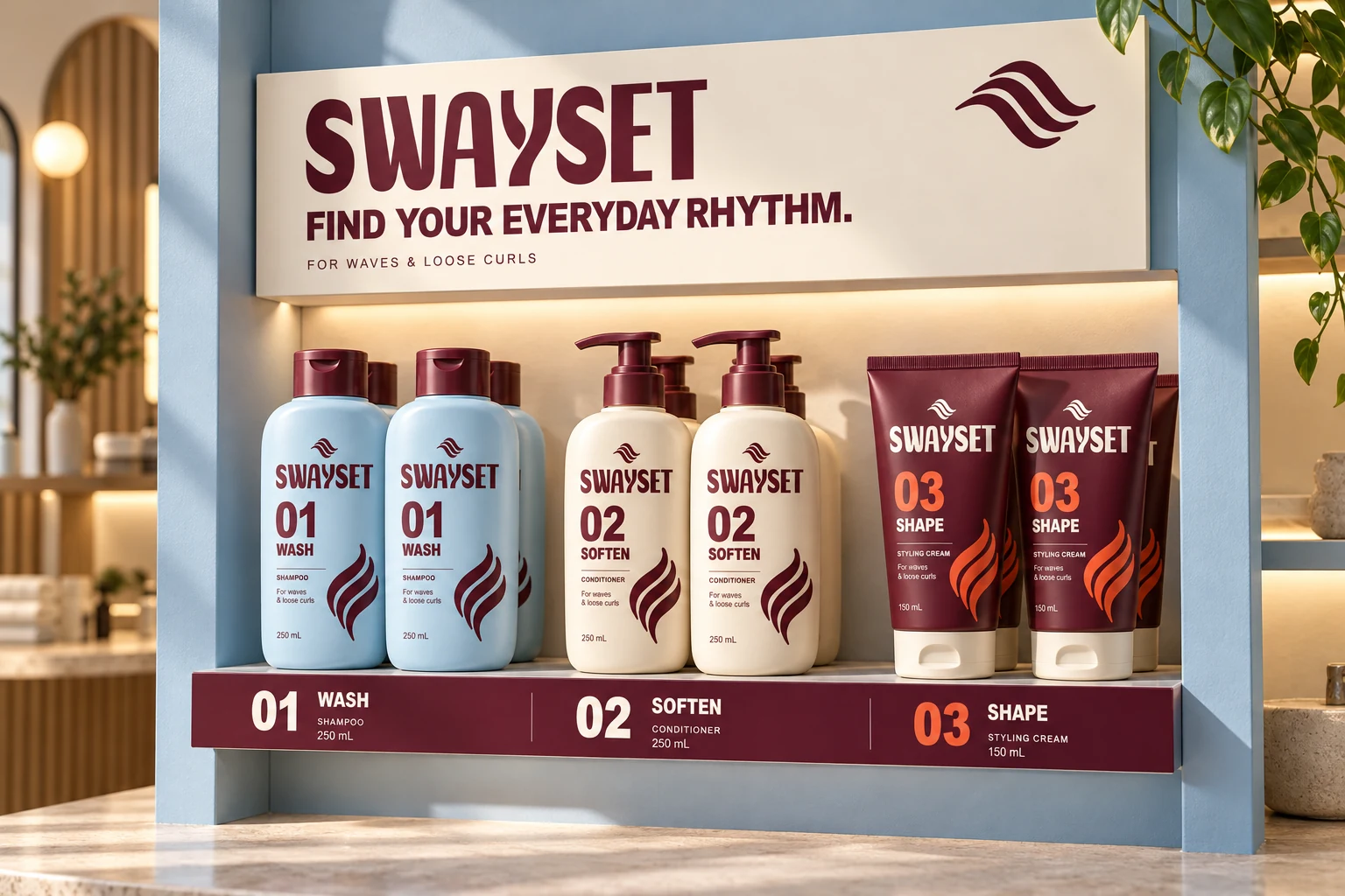
A range that belongs together.
Shelf graphics and supporting materials extend the strand motif without obscuring the product sequence.
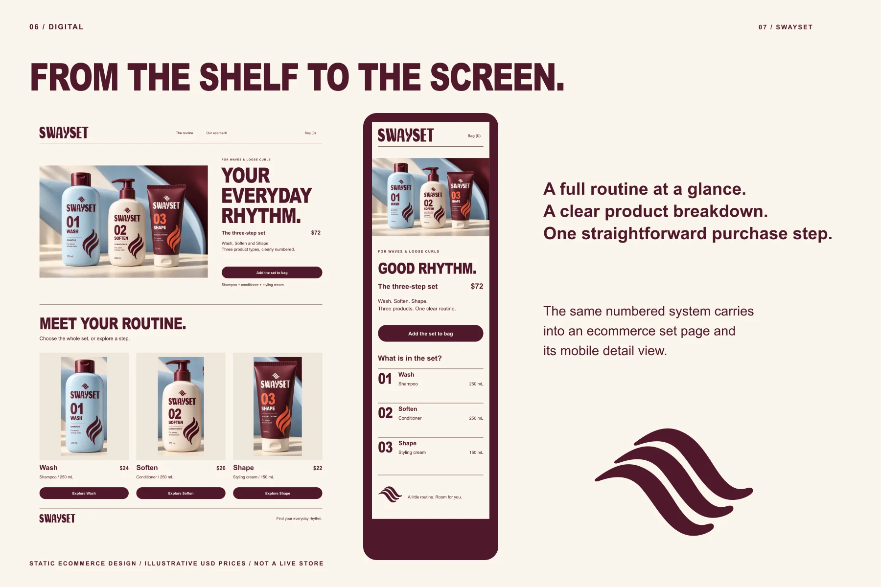
The routine, on screen.
Product-page layouts carry the same hierarchy into a set-based digital experience.
The artwork behind the image.
Flat artwork makes the hierarchy and construction visible. It is the reference for applying the identity consistently.
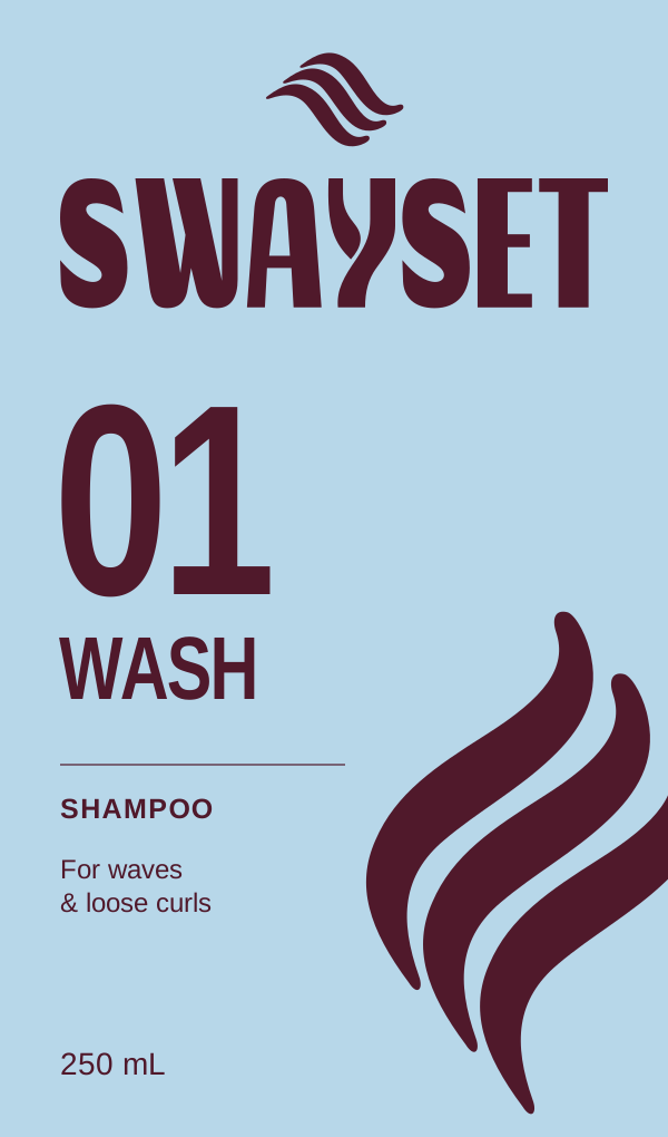
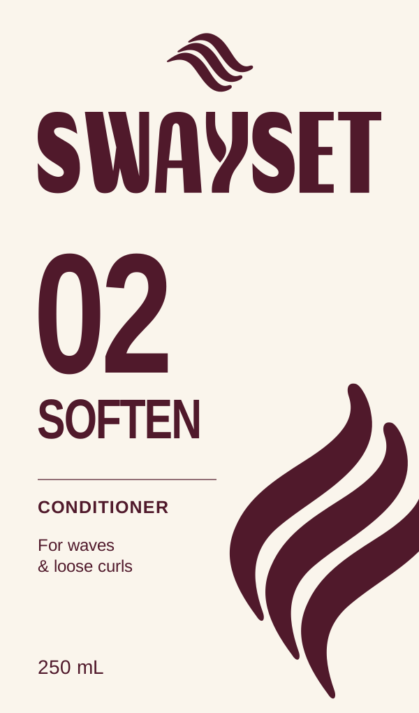
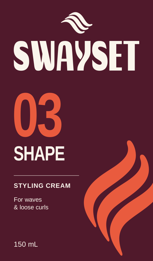
The same idea, carried further.
The identity extends beyond the logo through typography, composition and recurring graphic elements.
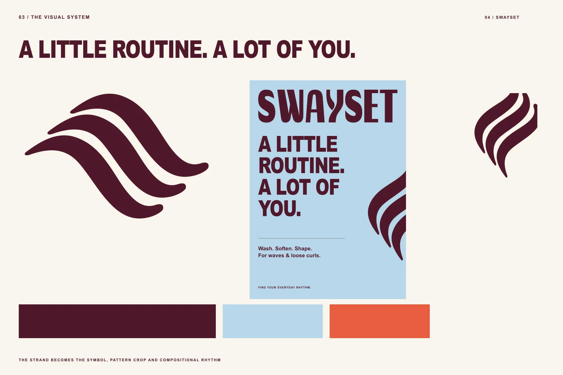
Explore the complete identity.
See the mark, design system and applications together in the project presentation.
Design scope and image notes
Product scenes visualize the identity. Labels are design studies, not regulatory-reviewed or manufacturing-ready packaging.
Dimensional images are visualizations and may vary in small details from the native vector artwork. The presentation demonstrates design work; no commercial performance results are claimed.
Portfolio applications show the reach of a visual system. Client deliverables are agreed individually; extended applications and production artwork are scoped separately.
Let’s give it a clear identity.
Tell me what you’re building, who it is for and where the design needs to work.
Start your project ↗