Workflow software / Visual identity
Good work. In the right hands.
A visual identity built around a simple idea: every piece of work should have context, a decision and a next owner.
Visual identity / Lettering / Graphic system / Application design
A specific starting point.
Make a workflow tool feel human and recognizable while keeping approval status and responsibility clear in compact interfaces.
A reason for the form.
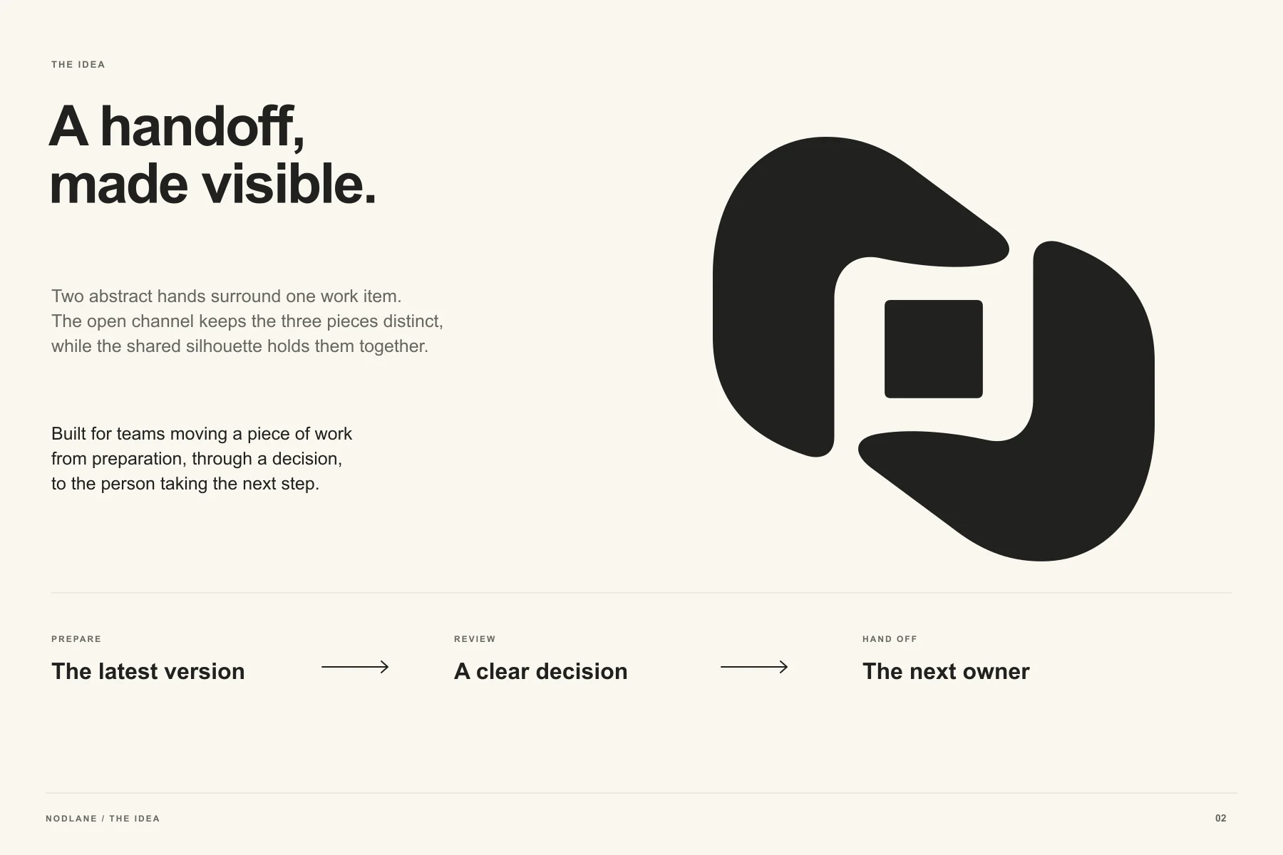
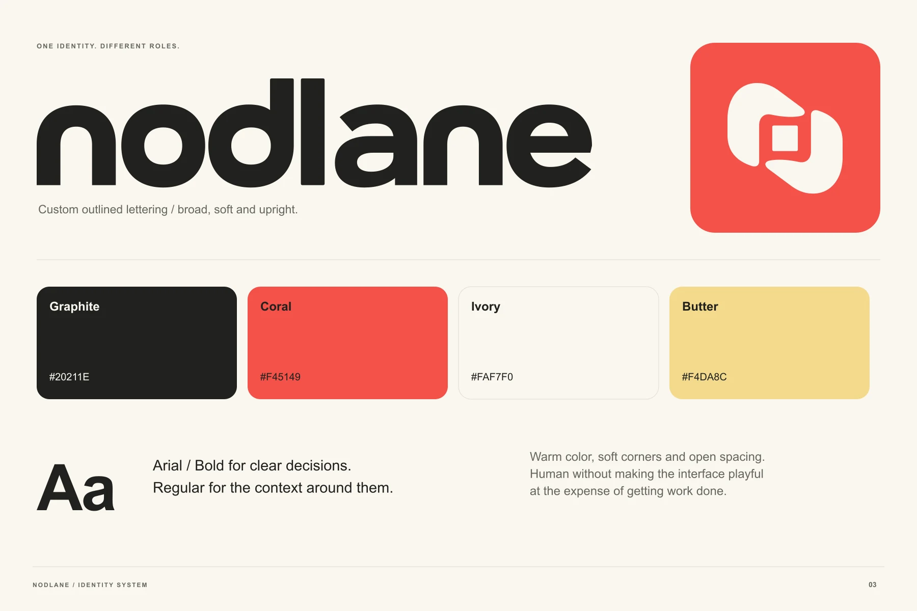
Two hands surround a work item. The symbol becomes a visual model for holding context and passing a decision forward.
A system with a purpose.
Soft, upright lettering and warm coral give the identity personality. Controlled color and explicit labels distinguish state and action without asking the logo to explain the entire product.
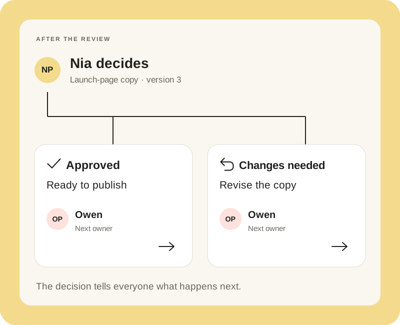
One version. One decision.
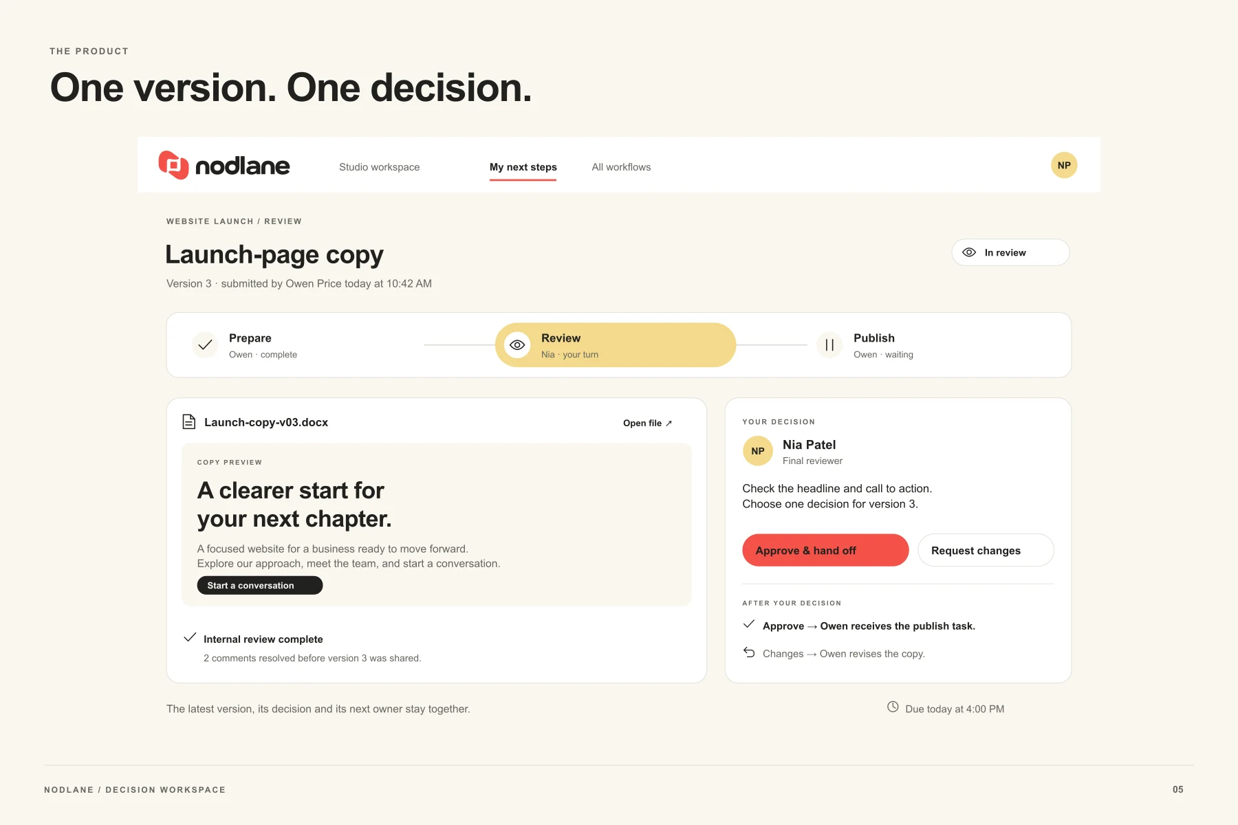
The desktop workspace keeps the current file, review step and next owner together. The decision has a clear consequence: approve and hand off, or request changes.
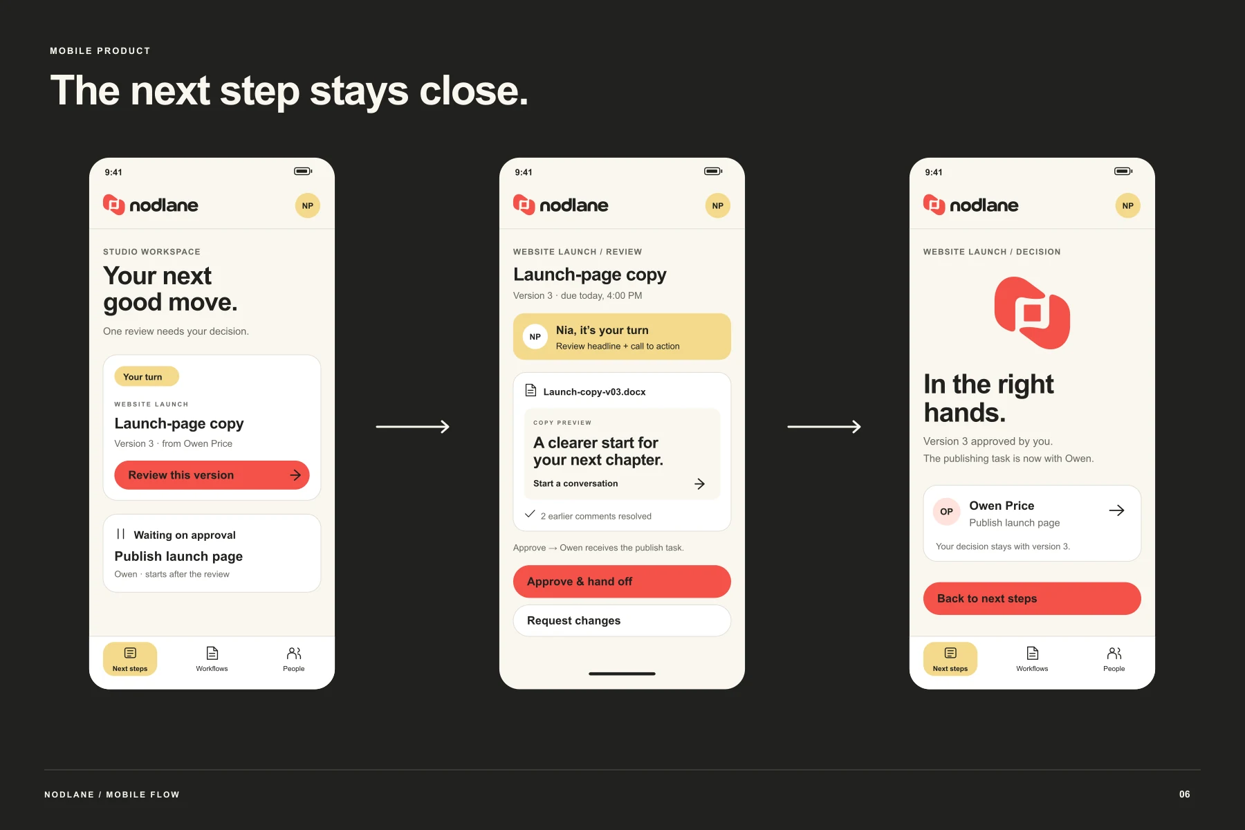
The next step stays close.
A mobile sequence moves from a personal queue to a focused review and then a confirmed handoff. Status is stated in words as well as color.
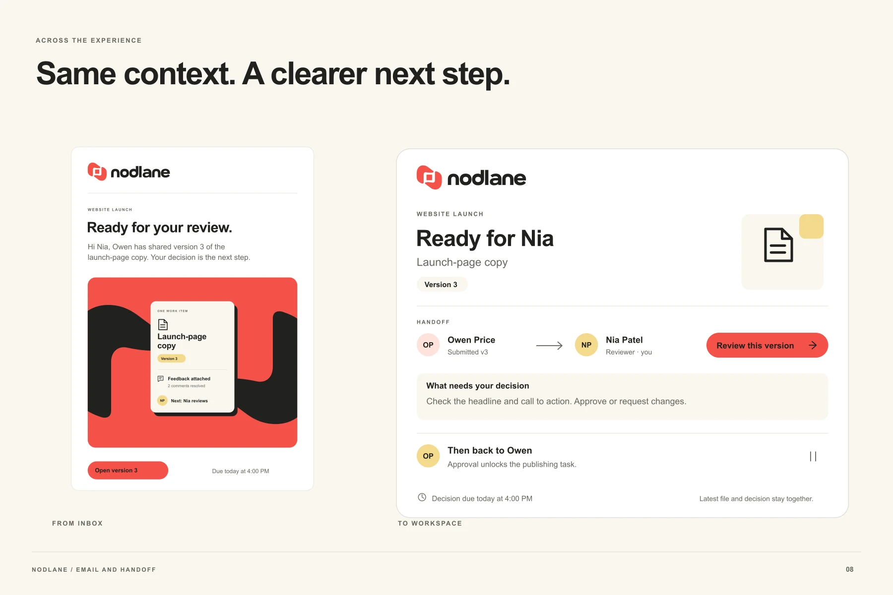
The same voice beyond the workspace.
The launch page and review email carry the identity into explanation and everyday communication.
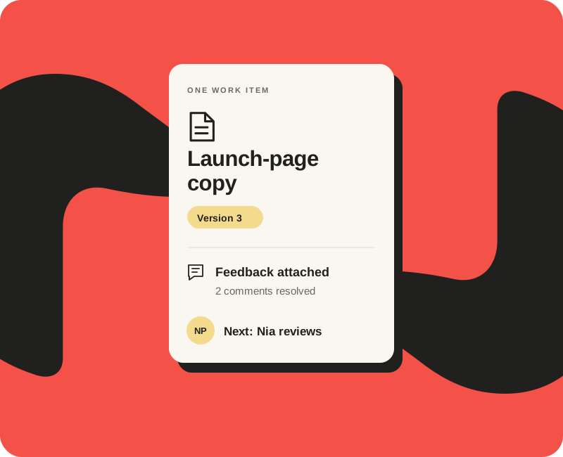
The artwork behind the image.
Flat artwork makes the hierarchy and construction visible. It is the reference for applying the identity consistently.
The same idea, carried further.
The identity extends beyond the logo through typography, composition and recurring graphic elements.
Explore the complete identity.
See the mark, design system and applications together in the project presentation.
Design scope and image notes
Product screens are static interface designs. They are not a deployed application, usability study or evidence of adoption.
Dimensional images are visualizations and may vary in small details from the native vector artwork. The presentation demonstrates design work; no commercial performance results are claimed.
Portfolio applications show the reach of a visual system. Client deliverables are agreed individually; extended applications and production artwork are scoped separately.
Let’s give it a clear identity.
Tell me what you’re building, who it is for and where the design needs to work.
Start your project ↗