Music & arts / Visual identity
Make room.
An expanding typographic identity that makes space for music, people and the information that brings them together.
Visual identity / Lettering / Graphic system / Application design
A specific starting point.
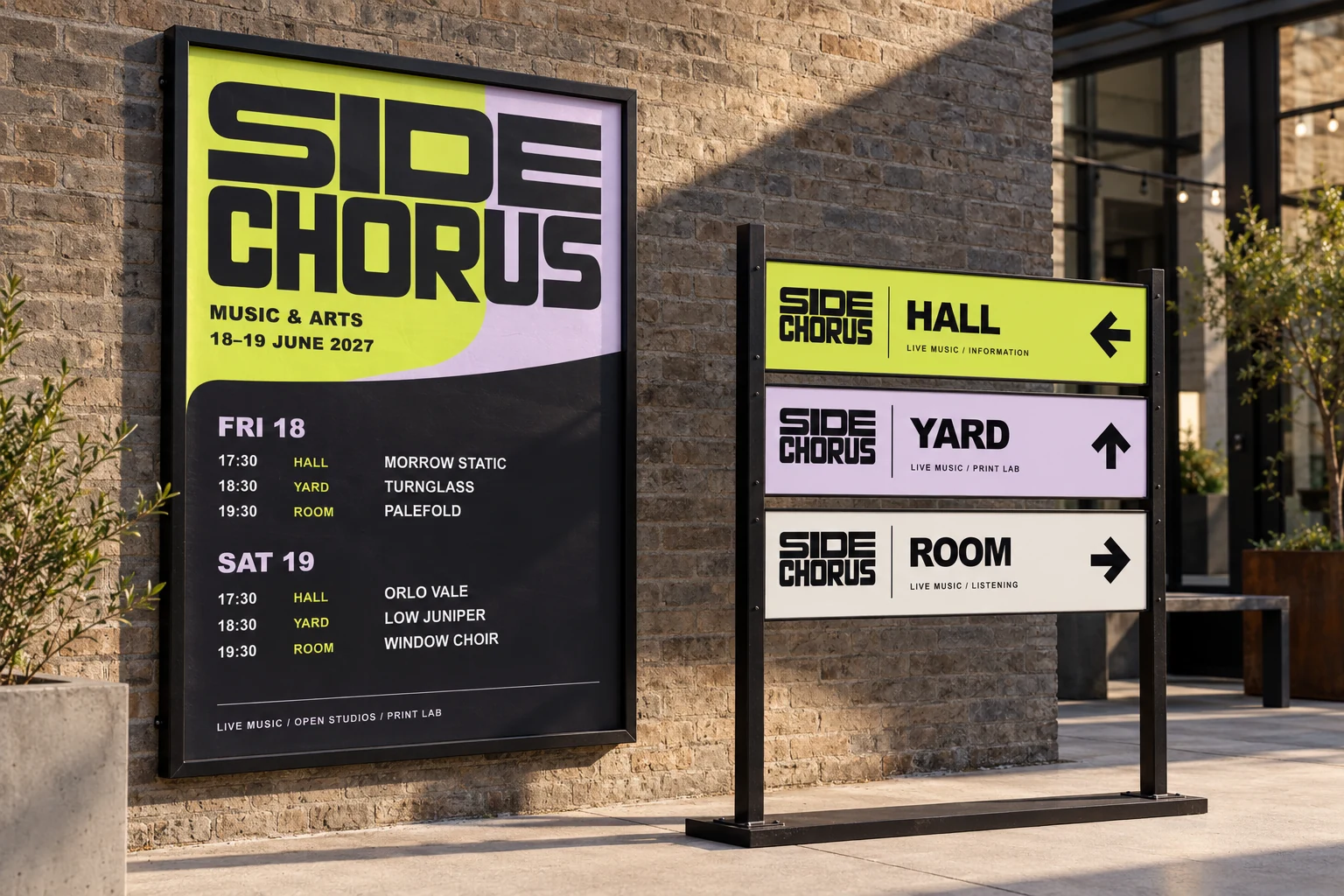
Give a music and arts program a bold, flexible identity that remains useful on dense schedules, compact tickets and street-scale signs.
A reason for the form.
Wide SIDE sits above compressed CHORUS. The contrast in width becomes a flexible system; the O counter opens into a frame for information.
A system with a purpose.
Three controlled width states adapt to the available space. Chartreuse and mauve give the program energy, while a strict information hierarchy keeps acts, times and venues legible.

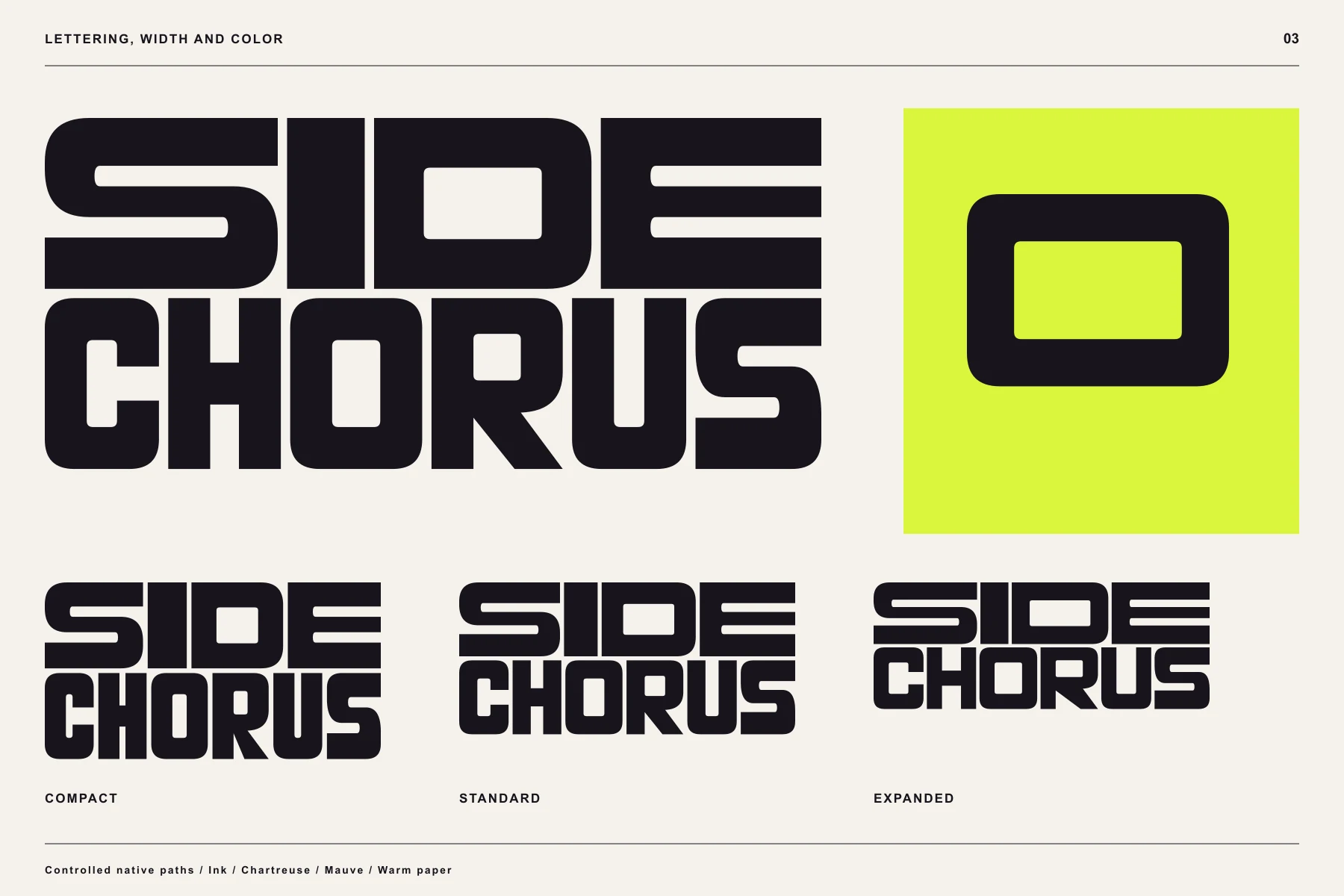
One voice, different widths.
Compact, standard and expanded lettering preserve the same construction while changing the amount of room the identity takes up.
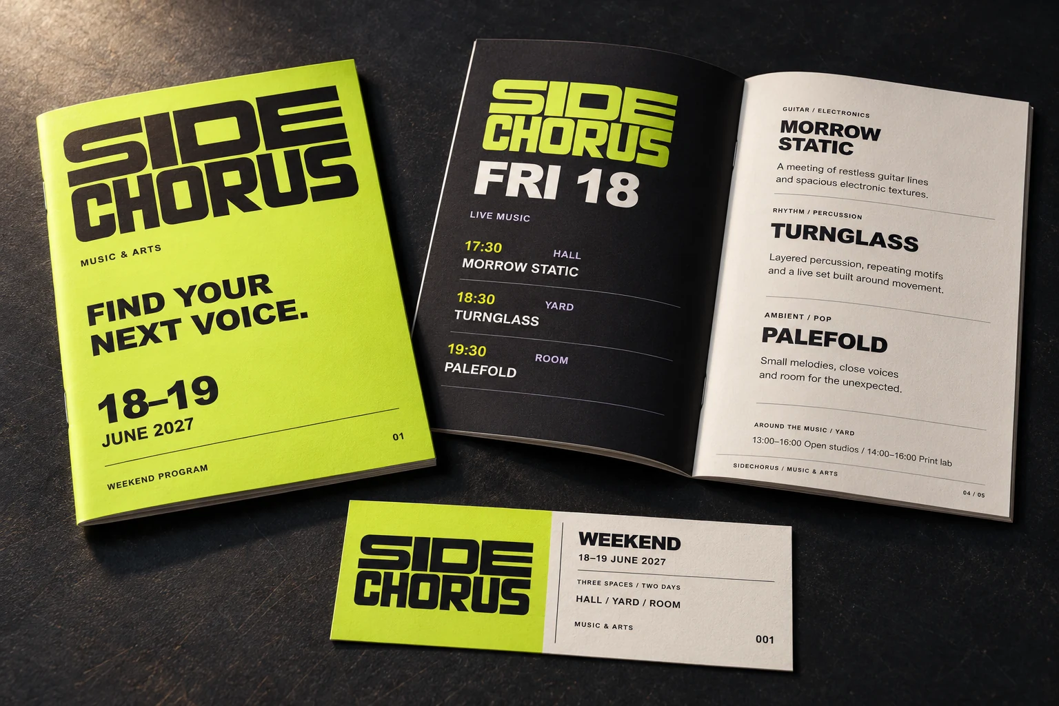
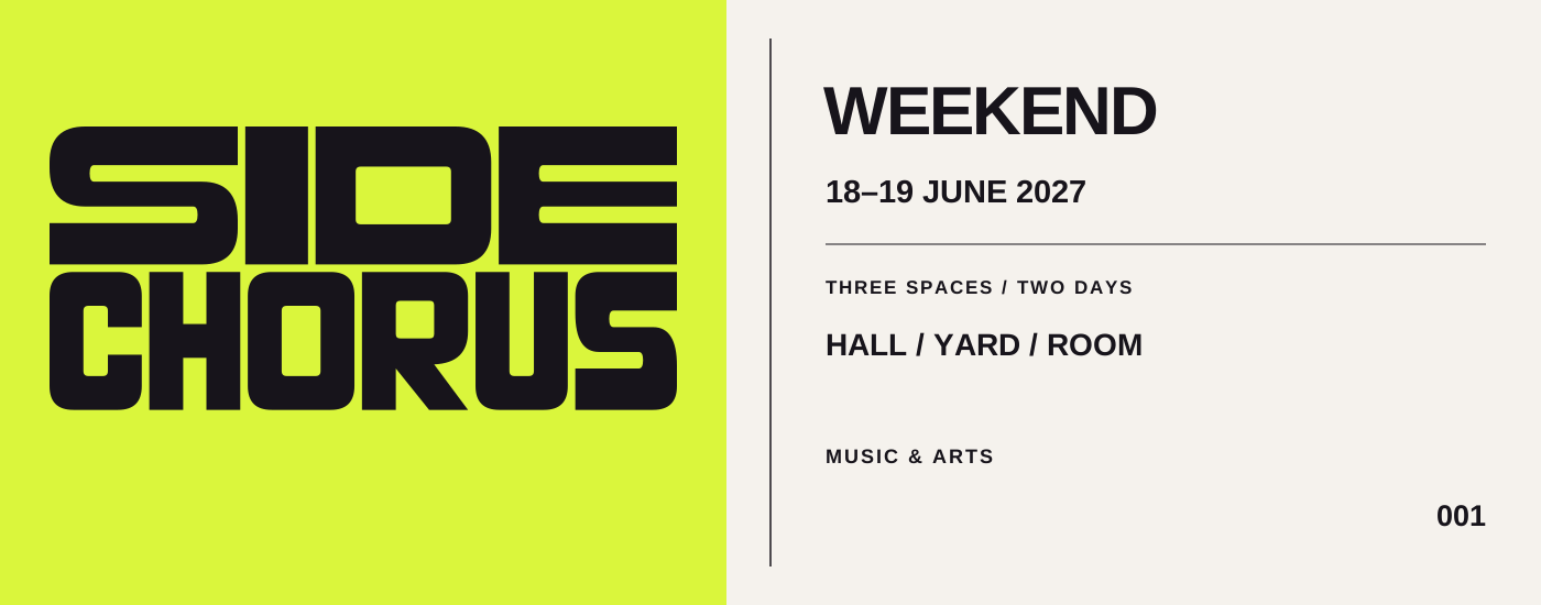
A weekend in your hand.
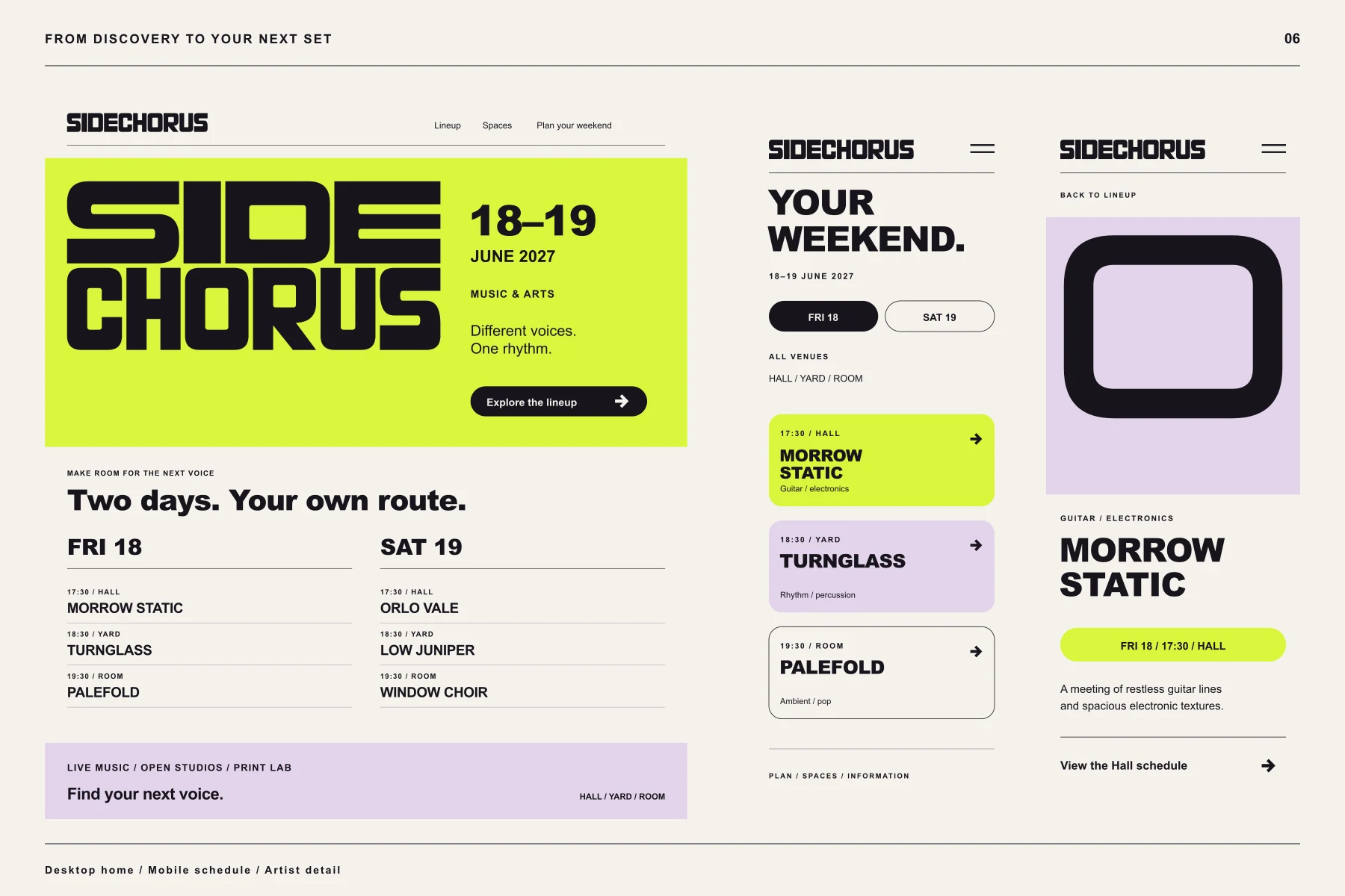
The program and ticket use the same hierarchy as the street graphics, from the main event to the individual set time.
Follow the information.
Schedule and artist layouts carry the identity into smaller screens, where clarity has to survive the reduction in space.
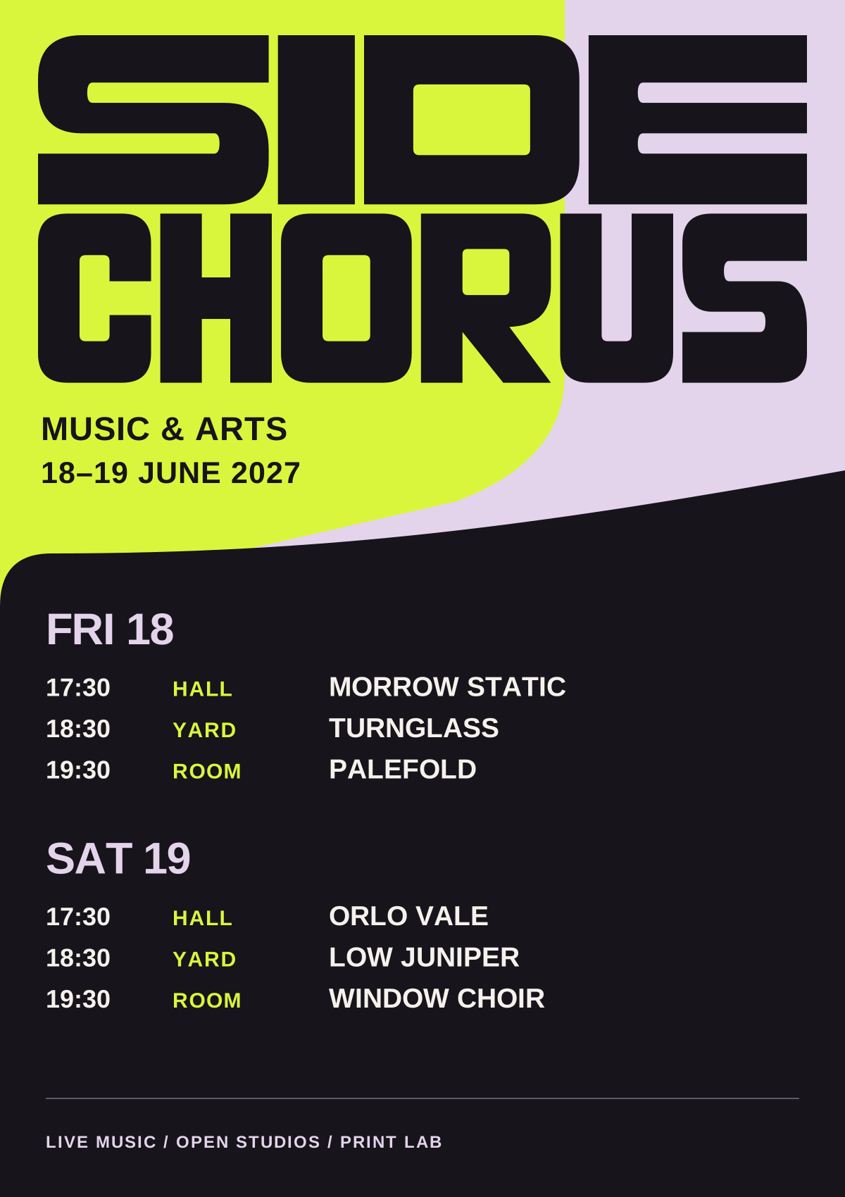
The artwork behind the image.
Flat artwork makes the hierarchy and construction visible. It is the reference for applying the identity consistently.
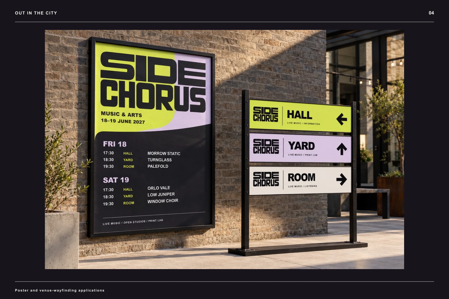
The same idea, carried further.
The identity extends beyond the logo through typography, composition and recurring graphic elements.
The counter makes room.
An eight-second silent study: the lettering opens a space for the program. Press play to explore the movement.
Explore the complete identity.
See the mark, design system and applications together in the project presentation.
Design scope and image notes
Event dates, acts, venues and operating information are illustrative. The silent motion study demonstrates a design behavior, not a general-purpose variable font.
Dimensional images are visualizations and may vary in small details from the native vector artwork. The presentation demonstrates design work; no commercial performance results are claimed.
Portfolio applications show the reach of a visual system. Client deliverables are agreed individually; extended applications and production artwork are scoped separately.
Let’s give it a clear identity.
Tell me what you’re building, who it is for and where the design needs to work.
Start your project ↗