

Take the
long way round.
A compact F/L mark and an unapologetically heavy wordmark. An identity built for the everyday loop, from the smallest woven label to the wider world around it.

A little farther.
A lot of character.
Farloop brings personality to the things people run with. The visual system takes its cue from a route: a straight, a shoulder, a turn, then the next stretch.
The F/L monogram condenses the name into a compact shape. Its rounded shoulder and cut terminals become the graphic language of labels, packaging and layouts. Pine grounds the identity; ecru opens it up; acid makes the key details count.
A mark with a turn.
The sharp monogram and heavy mixed-case name work together. The period is part of the wordmark; the small F/L stands alone where space is limited.

Capital F. Lowercase rhythm. A square full stop.
Paired with direct labels and clear product information.
Built to go together.
Color, material direction and useful labeling connect socks, headwear and carry gear. Each product gives the identity a different job.
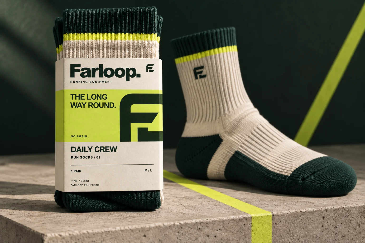
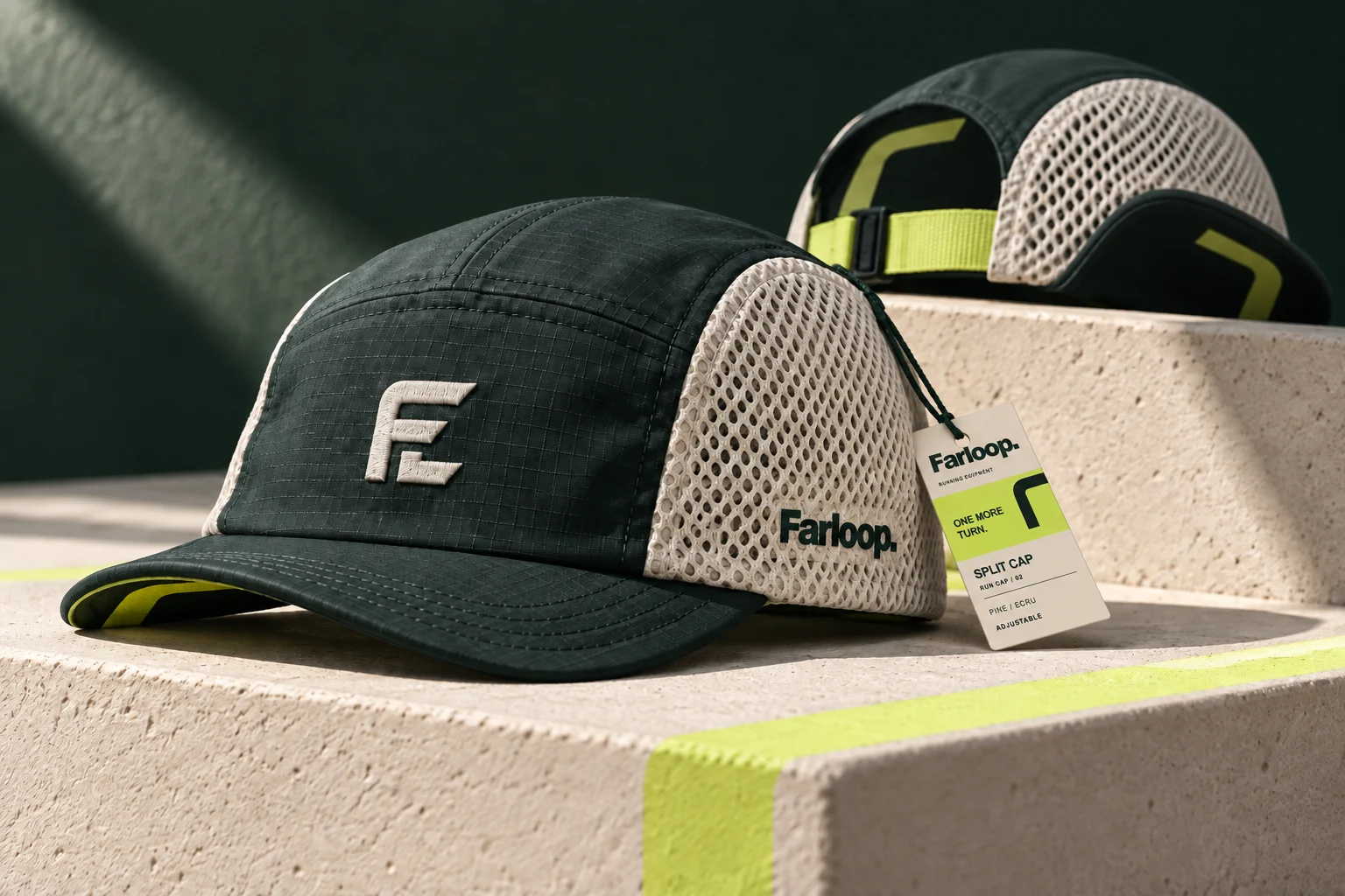
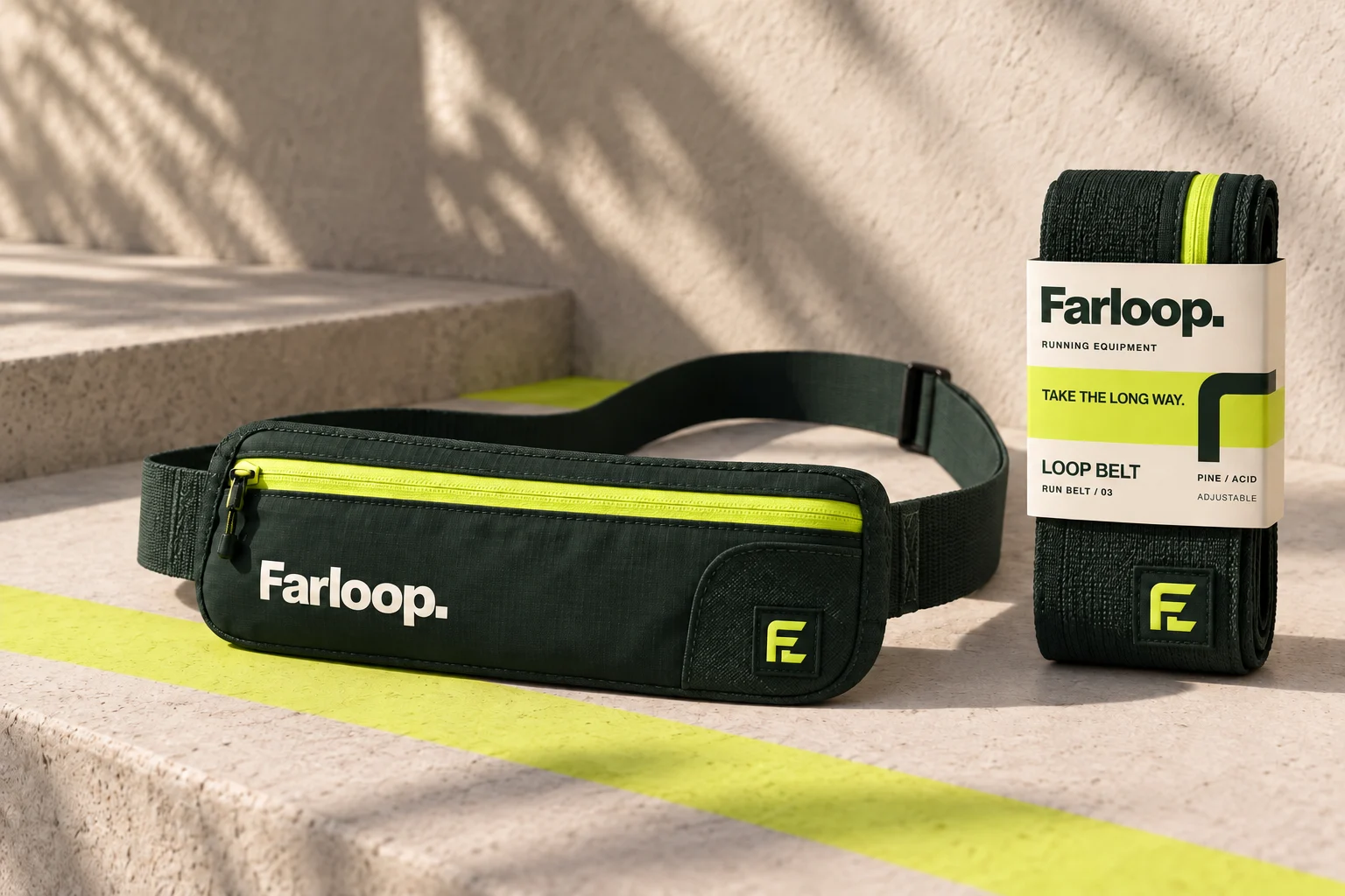
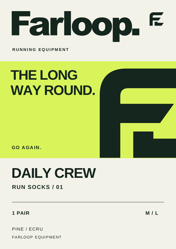
01 / SLEEVE FRONT
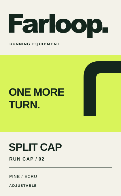
02 / HANGTAG FRONT
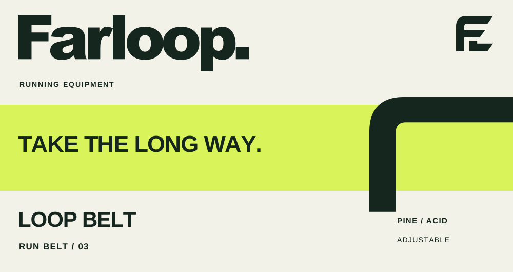
03 / RETAIL BAND
The next
turn starts
here.

One rounded shoulder. One cut ending. The supporting graphic comes directly from the logo, then stretches across the rest of the identity.
From shelf to screen.
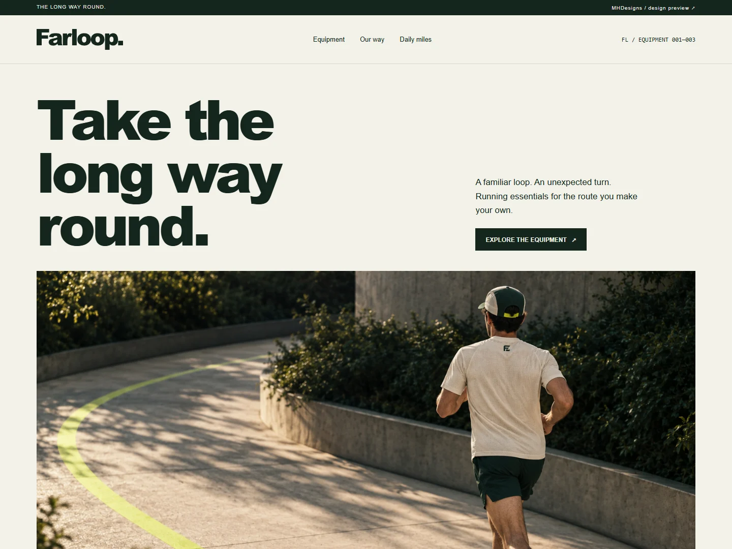
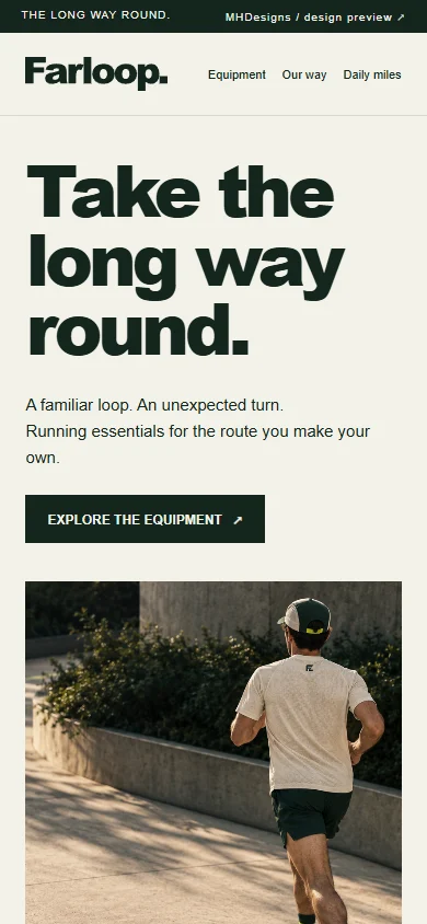
A responsive product experience that carries the same type, palette and photographic direction into browsing the range.
Give your brand
a system of its own.
Need a distinctive logo and a consistent visual identity? Tell me about your business, what you need and where it needs to work.