MHDesignsDayshift

Brand identity / Coffee roasters

A little more warmth.
Every day.

Expressive lettering, an open-handed welcome and an approachable coffee range. An identity built around the pleasure of a daily ritual.

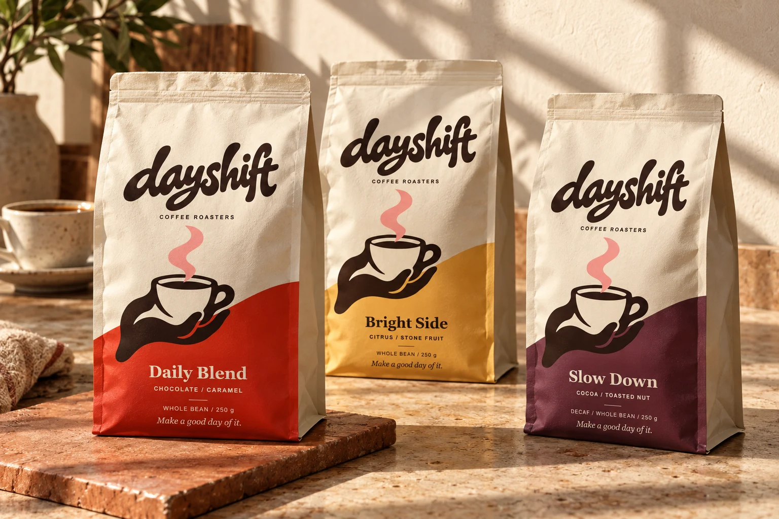
Dayshift Daily Blend, Bright Side and Slow Down bags in warm morning light
Packaging visualization / Daily Blend, Bright Side and Slow Down

01 / The idea

Good coffee.
Good company.

Dayshift is built for people who enjoy good coffee without needing a lesson in it. The design has to feel welcoming at a café and remain easy to navigate on a retail shelf.

The connected lettering provides a confident signature. The hand offering a cup gives the brand a human gesture. Together, they make the invitation simple: make a good day of it.

Dayshift wordmark in whiteExpressive signature / Primary identifier
Hand offering a cup, with curling steamAn open-handed welcome / Supporting illustration
One family.
A blend for your pace.

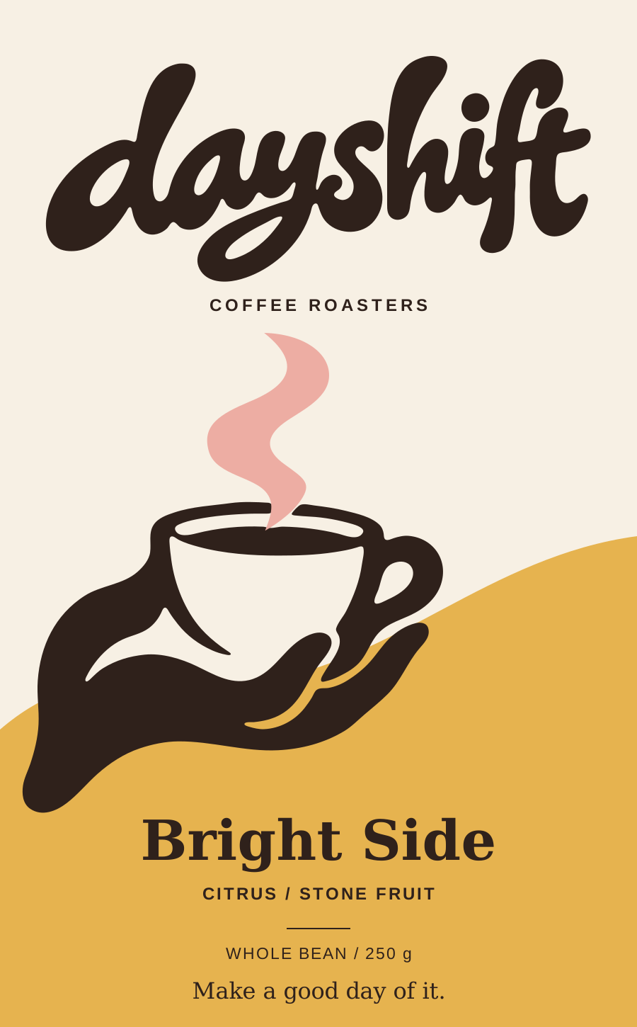
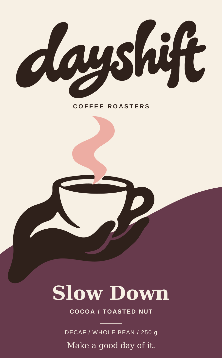
Consistent lettering and illustration build recognition. Distinct color fields, readable blend names and concise tasting notes make choosing a bag straightforward.

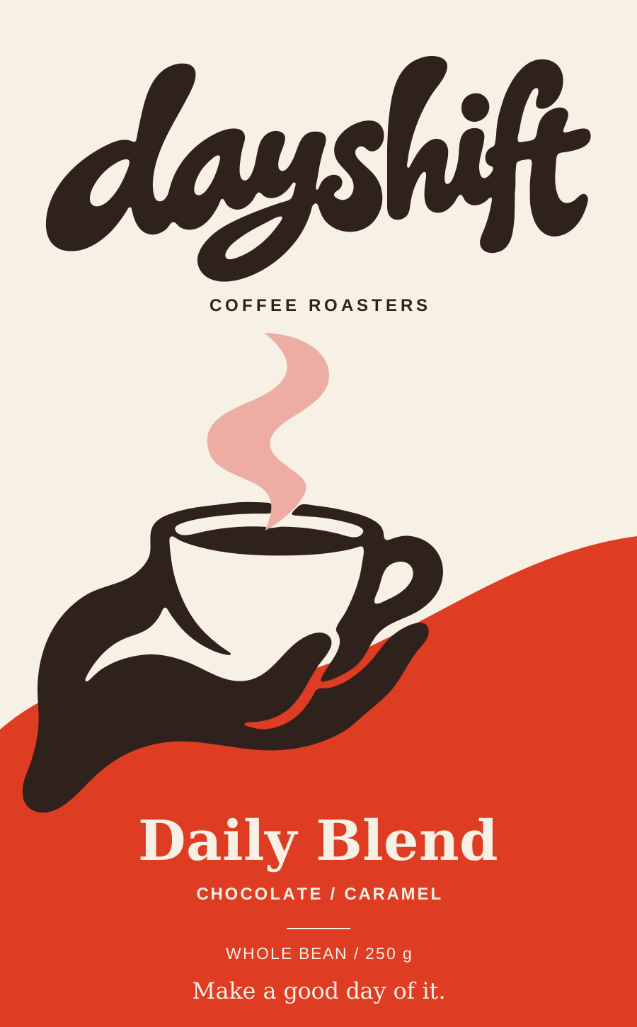
Daily Blend flat packaging design in red
Daily BlendCHOCOLATE / CARAMEL
Bright Side flat packaging design in gold
Bright SideCITRUS / STONE FRUIT
Slow Down decaf flat packaging design in plum
Slow DownDECAF / COCOA / TOASTED NUT
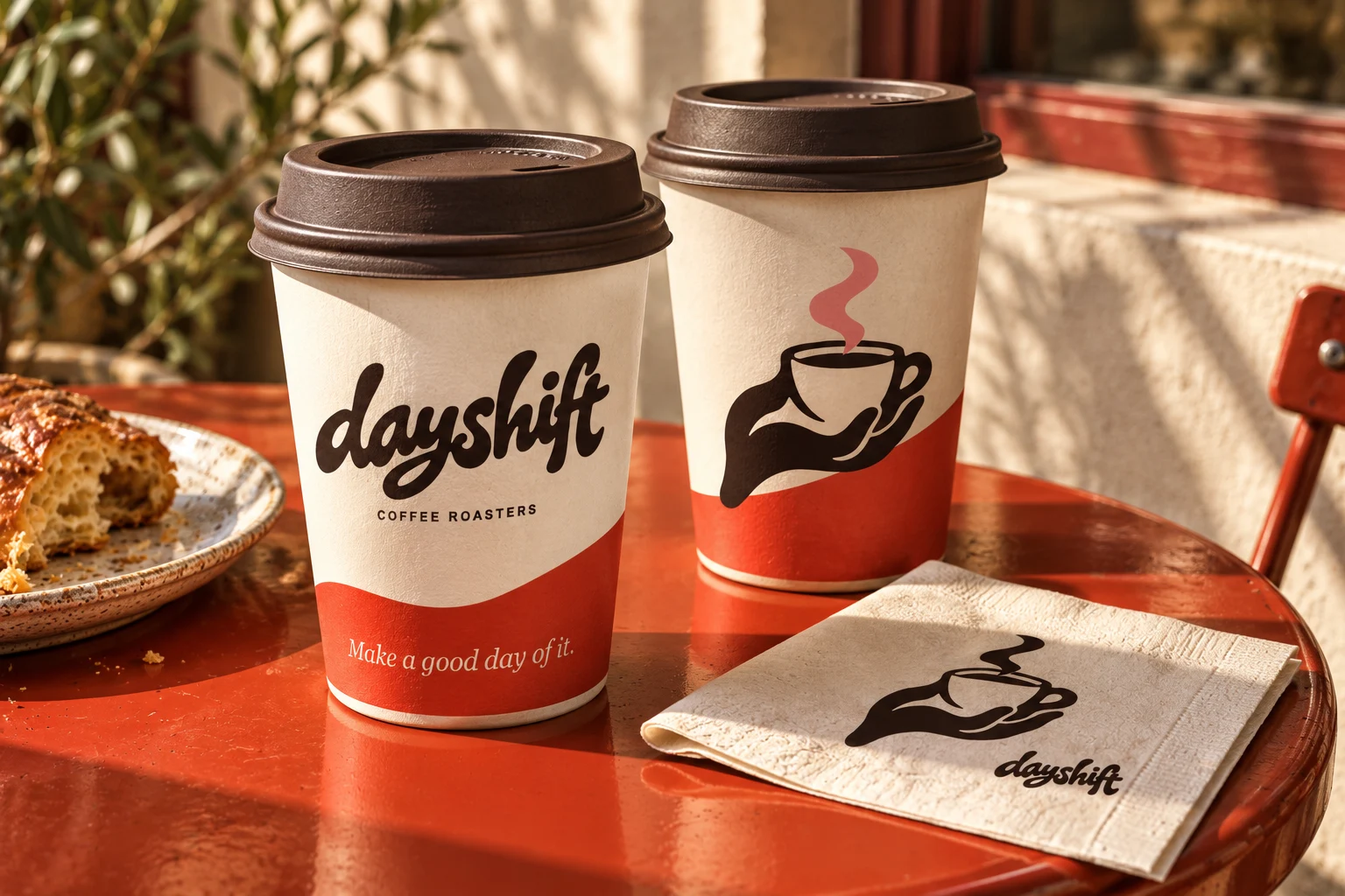
Two Dayshift cups show the signature and illustration sides of the printed wrap, beside a branded napkin
Café application visualization / Cup wrap and single-ink napkin

More than a logo
on a package.

The curved color field connects the retail bags and takeaway cups. The illustration also works in one ink, while the campaign typography carries the brand’s warmer voice.

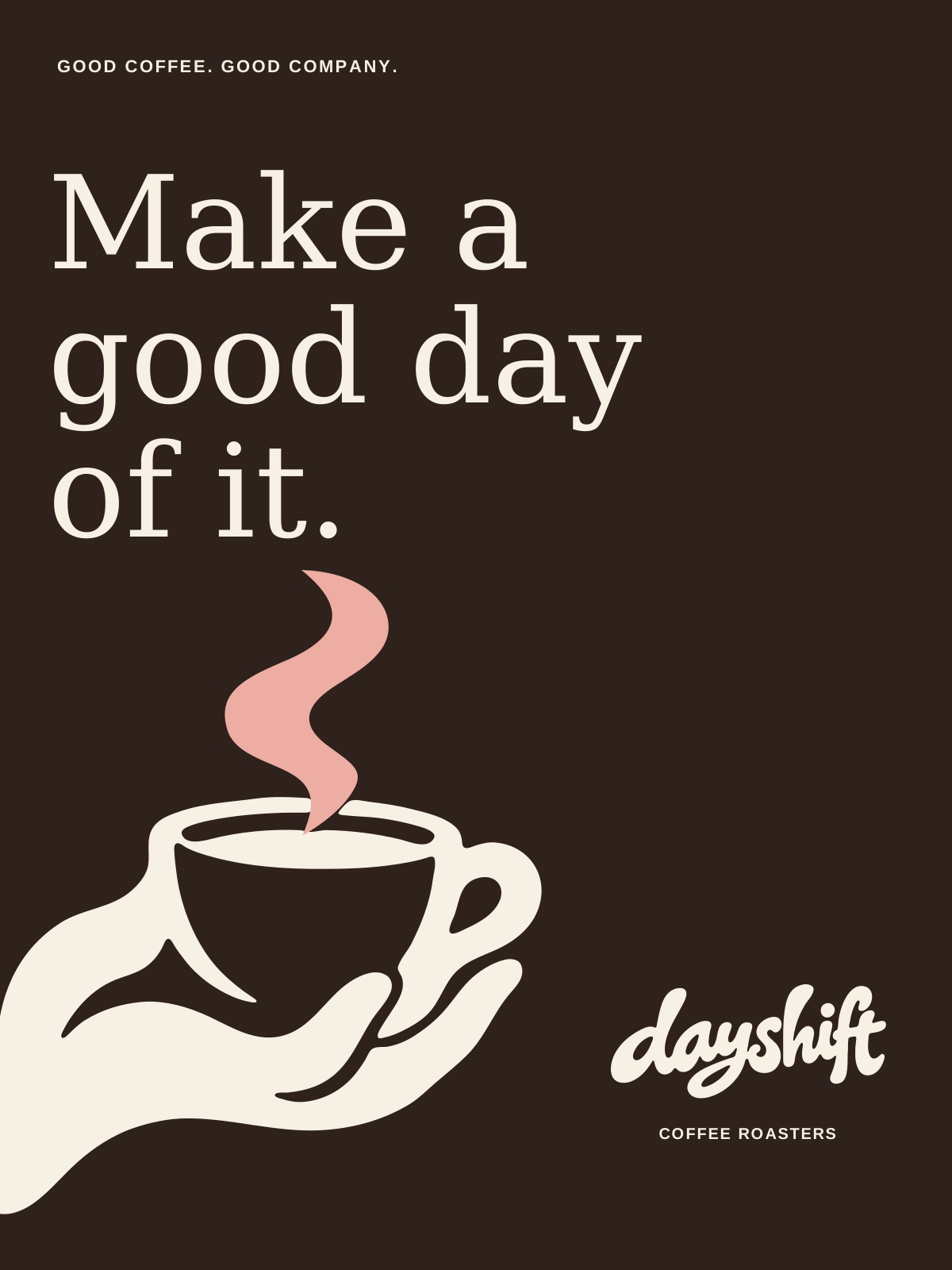
Espresso brown poster with large ivory italic lettering and a hand offering coffee
A campaign composition lets the message lead, with the signature acting as a sign-off.
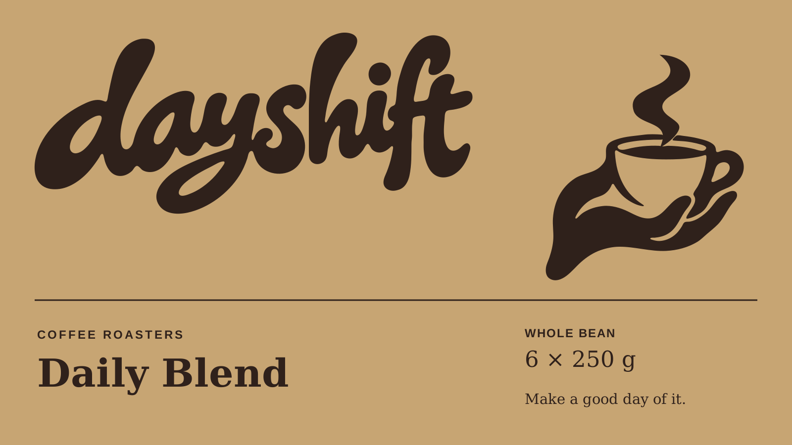
One-ink kraft wholesale carton layout with Daily Blend and six 250 gram packs
The wholesale face keeps the brand, blend and pack quantity clear in one ink. Layout study; supplier dimensions and production details remain to be specified.
Repeating pink and red steam shapes
The steam gesture becomes a supporting repeat. Use it selectively around the main signature.

02 / Working system

Warm by design.

Espresso and ivory provide the foundation. Vermillion adds energy; pink carries the steam. Gold and plum distinguish the additional blends.

Built to be used.

  • Path-based wordmark and supporting illustration.
  • Descriptor lockups with editable and outlined versions.
  • Georgia for product names and campaign lines; Arial for clear details.
  • Coordinated front and side-panel layouts for three blends.
  • Color, black and white assets, plus a concise usage guide.

03 / In motion

A line becomes
a daily ritual.

The lettering leads into steam, the offered cup and the packaging. A continuous camera journey connects the system to the café.

15-second brand film · Original sound effects
Press play to watch with sound.

Your next chapter

A distinctive logo.
A complete identity.

Tell me what your business does, who it serves and where the design needs to work. We’ll agree on a clear scope before the project begins.